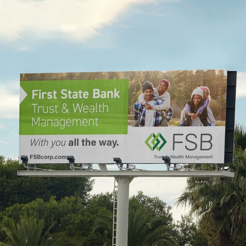
Have you ever taken or found a photo that you thought would be absolutely perfect for your website, only to find yourself struggling to make it fit? While banner photos remain a popular style in both websites and social media pages, choosing the right image takes a bit of careful planning.

Finding the right photo for a website banner can be a tricky process. The average website banner is around 4 times as wide as it is tall, or 4:1. The picture ratio for most cameras is 4:3. This means that only about ⅓ of the photograph will be visible when it’s used for the banner image. Below are some tips to help achieve a great looking banner photo.
Shoot in landscape
Be sure to only use landscape oriented photos. Portrait photos have a much smaller usable area when cropped to a banner size. This will result in a massive loss in photo quality, and make the website look very unprofessional. It is also nearly impossible to crop a portrait photo to the banner dimensions and have any sort of usable subject in the photo.


Take a step back
Zooming out and creating more room around the subject is crucial when taking photos for the website banner. It is often hard to imagine exactly how it is going to look when cropped down to the dimensions of the banner. Zooming out or moving farther away gives more options for cropping the photo. Many banner photos are also cropped dynamically to ensure that they look great at every screen size. This means that some photos will have a slightly taller and more narrow picture on some screens and a wider and shorter photo on others. Zooming out fixes this problem by having more negative space in the photo to fill in those areas that might get cropped out.


Leave room around your subject
This goes hand-in-hand with zooming out, but allowing for space around the subject leaves room more many different composition options. If there is a person in the banner image, but their shoulder goes off the edge of the photo, they will always be stuck to that side. However, if the photo has space all around them, there will be much more room to play with the cropping and composition of the banner image. Having more options will always end with a better final result.

Keep it simple
Simplicity is key in marketing. A busy photo can consume someone’s attention so much that they don’t take in the message that it’s paired with. Choosing a more neutral background, or removing unnecessary items in the photo, will draw one’s eyes to the subject and message much more effectively, ensuring that the information is consumed by a larger amount of website visitors.

Leave room for text
Banner images are fantastic for conveying messages quickly and efficiently, but only when there is room to place a message. Not only is it important to have an open area in the photo, but a shallow depth of field as well. This occurs when the subject is in focus but the background is blurry. Not only will the shallow depth of field attract your attention to the subject, but the text that is placed in the banner will also pop much more since it won’t be competing with the background of the photograph.

Rule of Thirds
To create the most visually compelling photo, it is best to use the rule of thirds. Divide the photo into thirds both vertically and horizontally. The four points where those divisions meet are the best place to place the subject of your photo. If the subject of the photo is facing a certain direction, be sure to allocate more space on that side to create proper balance.

Get Artsy
Some business don’t exactly have the most exciting visuals to use in their banner images. Sometimes getting a close up detail shot, or something that repeats, can be a great solution. A tech company may use a close up of their code on the computer for an interesting photo. The benefit to photos like this is that the cropping isn’t as important. There will be interesting details to look at in almost any size.

Panoramics
It can be hard to get a great panoramic photo. Moving objects and an unsteady hand can create artifacts that look unnatural. However, most panoramic photos are already the perfect size for a banner image, require little to no cropping, and provide a unique look to catch attention.

In Short
Getting the perfect banner image may take more effort and planning that most other photos for your website, but spending a little extra time and attention will make a big difference. It’s just one more way for your brand to make a great first impression and stand out among the competition.

