When you think of rock bands, branding might not be the first thing you think of. But a band’s logo often follows them through their entire career; it’s instant recognition for their fans, not to mention a selling point at the merch table. So you might think that changing an established logo would be a bad idea. In this case, you would be wrong.

I’m a Foo Fighters fan.
I had the privilege of seeing them live (my second time doing so) at Wrigley Field in Chicago during their 2017 tour. As a forty-something, they were the rock band of my younger years. Dave Grohl even shouted from the stage that the true fans are the guys with some gray hair and Honda Odyssey keys dangling out of their back pockets. Mine happen to be Toyota Sienna keys, but his message struck a chord. (Yes. That was an intentional pun.)
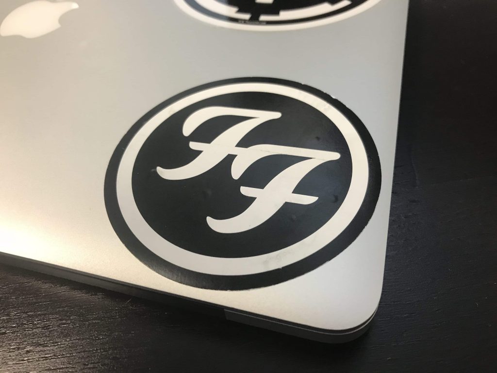
As with many bands and other organizations, the Foo Fighters logo has changed a few times over the years. Their most iconic logo has been two stylized cursive “F”s inside a circle like you see here. (Yes. That’s a snap of my laptop. I told you I was a fan.)


When The Foo Fighters released their album Concrete and Gold, they had a new logo on the cover. As you might expect, some fans hated it. Others loved it. I was on the fence about it…waiting to see how it was used.
I was not disappointed.
The malleability of the new Foo Fighters logo is amazing. Two block “F”s, arranged in a diamond, allowed for numerous interpretations. Is that an equal sign in the negative space? Maybe it’s a slash through a “pause” symbol (because you shouldn’t pause their music.) Maybe it just is what it is.
Either way the lighting designer, Dan Hadley, had a field day with it. The diamond screen behind the stage featured the logo in multiple ways. In some instances it filled the diamond. In others, it was interpreted as different items. My personal favorite was when the diamond flew out over Taylor Hawkins and took on the shape of fluorescent lights on an office ceiling.
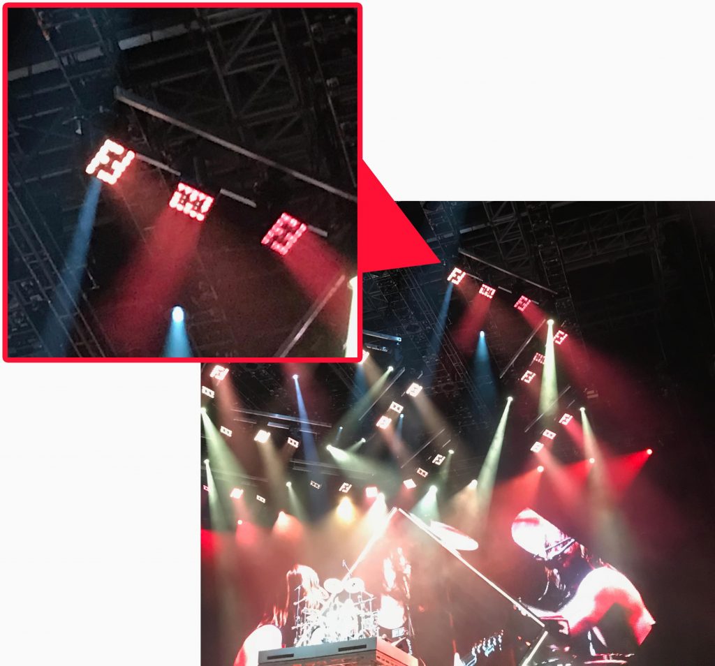
But the one thing that really caught my eye was when the logo was used on the LED light panels. It was such a small thing, but it showed what you could do with a truly well thought-out logo.
After digging around quite a bit I wasn’t able to find out who deserved credit for the design of the new Foo Fighters logo. But whoever it was, they get it. They know that a logo design doesn’t have to be highly detailed or flashy. A good logo design needs to be identifiable, enjoyable, and most of all able to be used in numerous situations. Even if you end up having it set in concrete and gold.


